Metering data is a time series with structure hiding in plain sight. In R you can decompose electricity load into trend, weekly seasonality and noise — and read a weekday load profile straight off the data.
Author
Rverse Analytics
Published
June 22, 2026
Electricity and utility metering produces exactly the kind of data R was built for: a long, regular time series with a trend, repeating seasonal patterns and noise all tangled together. Pulling those apart is the first step toward forecasting demand, spotting anomalies and sizing tariffs. Here’s the core workflow on a simulated daily-load series.
A realistic load series
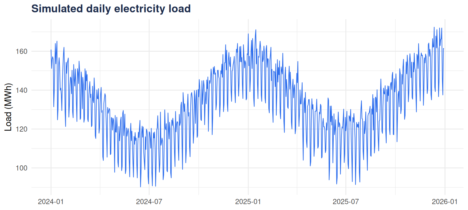
We’ll simulate two years of daily consumption with an annual heating/cooling cycle, a weekday-vs-weekend pattern, a gentle upward trend and random noise — the ingredients of real metering data:
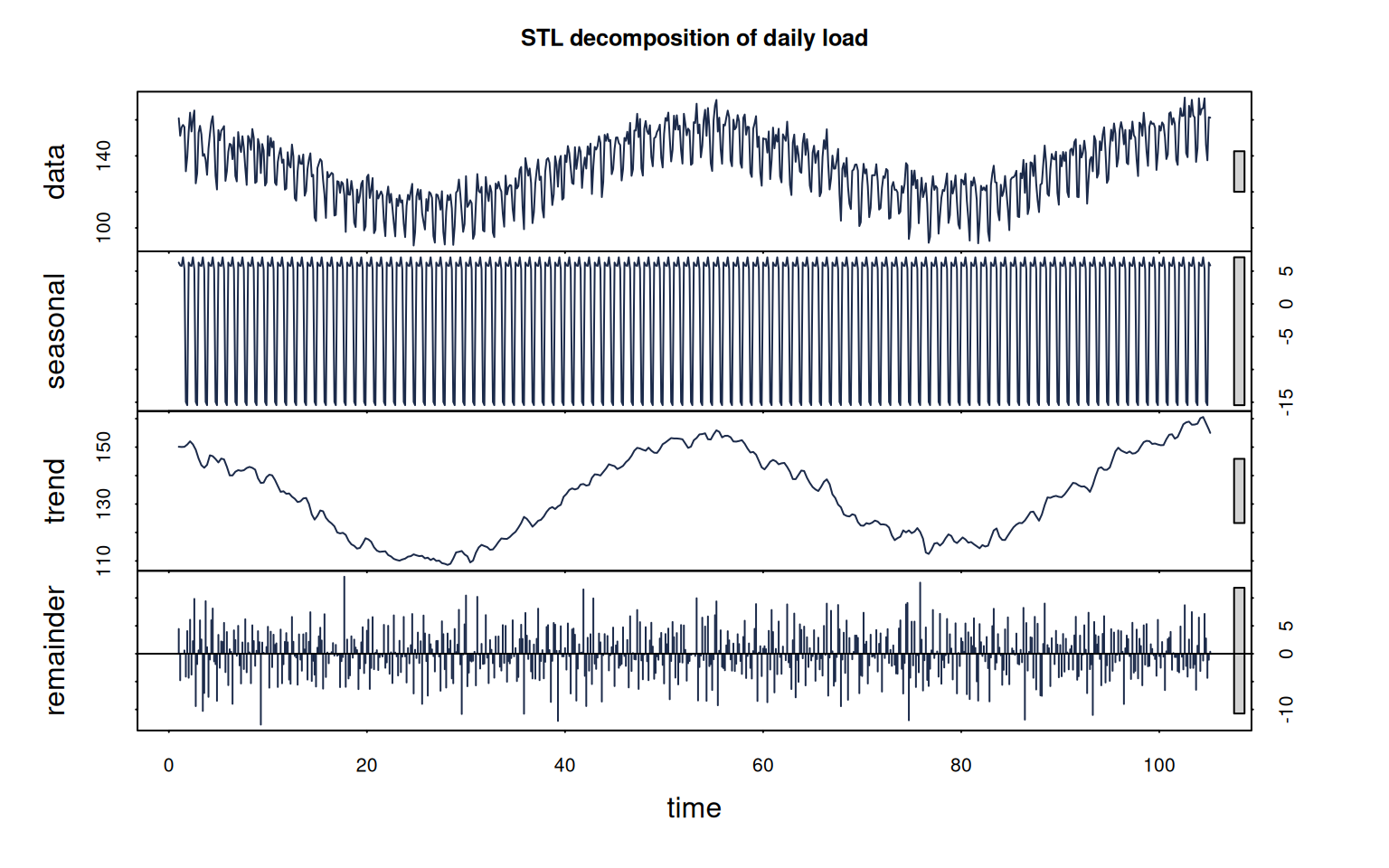
stl() (seasonal-trend decomposition using loess) splits the series into interpretable components. With a weekly period it isolates the Monday-to-Sunday cycle and leaves the annual swing in the trend:
ts_load <-ts(load, frequency =7)fit <-stl(ts_load, s.window ="periodic")plot(fit, col ="#1b2a4a", main ="STL decomposition of daily load")
Figure 2
Each panel is a story: the trend shows underlying growth and the seasonal swing, the seasonal panel is the repeating weekly shape, and the remainder is what’s left — where anomalies and one-off events show up.
Read the weekday profile
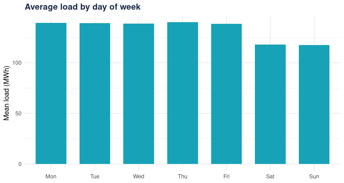
Aggregate straight from the data to get the average load by day of week — the “load profile” utilities plan around:
labs_wday <-c("Mon", "Tue", "Wed", "Thu", "Fri", "Sat", "Sun")prof <-aggregate(load ~ wday, data =data.frame(load, wday), FUN = mean)prof$label <-factor(labs_wday[prof$wday], levels = labs_wday)ggplot(prof, aes(label, load)) +geom_col(fill ="#17a2b8", width =0.7) +labs(title ="Average load by day of week",x =NULL, y ="Mean load (MWh)") +theme_minimal(base_family ="sans") +theme(plot.title =element_text(face ="bold", colour ="#1b2a4a"))
Figure 3
The weekend drop is unmistakable — and once it’s quantified, it feeds directly into forecasting and capacity planning.
Where this goes next
Decomposition is the foundation; from here the same data supports forecasting (forecast, prophet, or a seasonal ARIMA), anomaly detection on the remainder, and interactive dashboards that let operations teams explore load themselves. That last step is squarely our Shiny practice, and the energy sector is one of the industries we serve.
Have meter or market data that needs turning into decisions? Tell us about it.