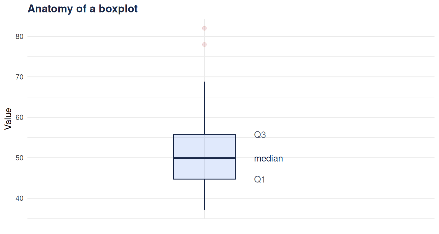
What the box, whiskers, line and dots in a boxplot actually mean — median, quartiles, IQR and outliers — with a labelled ggplot2 example in R.
Author
Rverse Analytics
Published
May 24, 2026
Boxplots are everywhere, yet often half-understood. In one compact picture they show a distribution’s centre, spread and outliers. Here’s exactly what each part means — and how to build one in R. (Need the numbers behind it? Use our descriptive statistics calculator.)
The anatomy
The line inside the box — the median (50th percentile).
The box — from Q1 (25th) to Q3 (75th) percentile; its height is the interquartile range (IQR), the spread of the middle half of the data.
The whiskers — extend to the most extreme points within 1.5 × IQR of the box.
The dots — points beyond the whiskers, flagged as potential outliers.
library(ggplot2)set.seed(6)d <-data.frame(y =c(rnorm(60, 50, 8), 78, 82)) # two outliersggplot(d, aes(x ="", y = y)) +geom_boxplot(width =0.35, fill ="#2f6fed", alpha =0.15,colour ="#1b2a4a", outlier.colour ="#b02a37", outlier.size =2) +annotate("text", x =1.28, y =median(d$y), label ="median", hjust =0, colour ="#1b2a4a") +annotate("text", x =1.28, y =quantile(d$y, .75), label ="Q3", hjust =0, colour ="#5a6478") +annotate("text", x =1.28, y =quantile(d$y, .25), label ="Q1", hjust =0, colour ="#5a6478") +labs(title ="Anatomy of a boxplot", x =NULL, y ="Value") +coord_cartesian(xlim =c(0.6, 1.7)) +theme_minimal(base_family ="sans") +theme(plot.title =element_text(face ="bold", colour ="#1b2a4a"))
Figure 1
Reading it at a glance
Skew: if the median sits off-centre in the box, or one whisker is much longer, the distribution is skewed.
Spread: a taller box means more variable data.
Comparisons: side-by-side boxplots make group differences (and different spreads) obvious — which is why they pair so well with a t-test or ANOVA.
One caution
A boxplot hides the shape within each region — a bimodal distribution can look identical to a uniform one. For small datasets, overlay the points (geom_jitter()) or use a violin plot to see the full picture.
Clear figures are half of good analysis. When you need publication-ready ones, that’s our work.