Same correlation, wildly different data: always plot first
statistics
ggplot2
data-quality
Anscombe’s quartet in tidy form — four datasets with identical summary statistics and completely different stories. A 50-year-old lesson that still gets ignored.
Author
Rverse Analytics
Published
May 12, 2026
A correlation coefficient in a report feels like a fact. But r is a summary, and summaries hide things. The classic demonstration is Anscombe’s quartet (1973) — four small datasets constructed to share nearly identical means, variances, correlations and regression lines. It ships with base R.
# A tibble: 4 × 5
  set         mean_x mean_y     r slope
  <chr>        <dbl>  <dbl> <dbl> <dbl>
1 Dataset I        9    7.5  0.82   0.5
2 Dataset II       9    7.5  0.82   0.5
3 Dataset III      9    7.5  0.82   0.5
4 Dataset IV       9    7.5  0.82   0.5
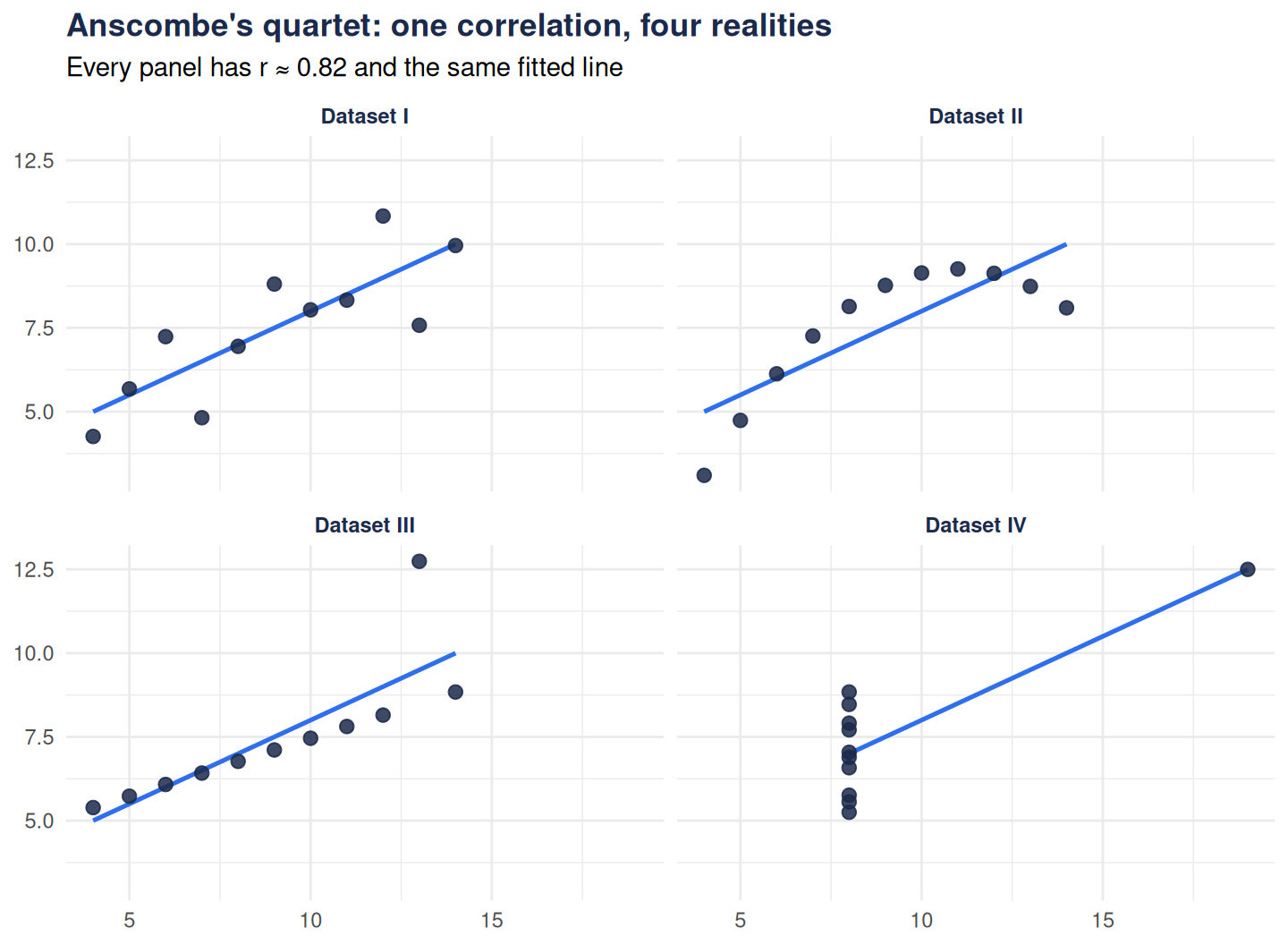
Four datasets, and to two decimal places the same mean, the same r = 0.82, the same regression slope.
…completely different stories
ggplot(quartet, aes(x, y)) +geom_smooth(method ="lm", se =FALSE,colour ="#2f6fed", linewidth =0.9, formula = y ~ x) +geom_point(colour ="#1b2a4a", size =2.4, alpha =0.85) +facet_wrap(~set) +labs(title ="Anscombe's quartet: one correlation, four realities",subtitle ="Every panel has r ≈ 0.82 and the same fitted line",x =NULL, y =NULL ) +theme_minimal() +theme(plot.title =element_text(face ="bold", colour ="#1b2a4a"),strip.text =element_text(face ="bold", colour ="#1b2a4a"))
Figure 1
Only Dataset I is what a reader imagines when they see “r = .82”: a linear relationship with noise. Dataset II is a curve — a linear model is simply the wrong shape. Dataset III is a perfect line plus one outlier dragging the fit. Dataset IV has no relationship at all; a single extreme point manufactures the entire correlation.
What this means in practice
Before any correlation or regression lands in one of our reports, the workflow is fixed:
Plot the raw data — a scatter plot per pair, faceted if there are groups.
Check influence — one point should never own the result (Cook’s distance, or just delete-and-refit).
Match the method to the shape — a monotone curve may call for Spearman’s rank correlation; a genuine curve calls for a different model, not a caveat.
The numbers are the end of the analysis. The picture is the beginning.