Standard deviation vs standard error: the difference, in R
statistics
r-tutorial
Standard deviation describes the spread of data; standard error describes the precision of the mean. An R simulation shows why the standard error shrinks as your sample grows.
Author
Rverse Analytics
Published
May 26, 2026
Mixing up standard deviation (SD) and standard error (SE) is one of the most common — and most consequential — errors in reporting. They answer different questions. Here’s the distinction, made concrete in R.
The one-line difference
Standard deviation (SD): how spread out the data are. A property of the population; it does not shrink as you collect more data.
Standard error (SE): how precise your estimate of the mean is. SE = SD / √n, so it does shrink as the sample grows.
\[SE = \frac{SD}{\sqrt{n}}\]
Watch the SE shrink (and the SD not)
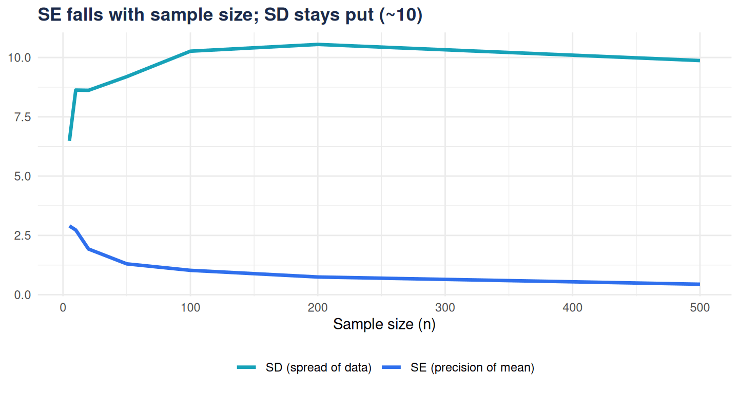
Draw larger and larger samples from the same population and track both:
library(ggplot2)set.seed(3)ns <-c(5, 10, 20, 50, 100, 200, 500)res <-do.call(rbind, lapply(ns, function(n) { x <-rnorm(n, mean =50, sd =10)data.frame(n = n, SD =sd(x), SE =sd(x) /sqrt(n))}))ggplot(res, aes(n)) +geom_line(aes(y = SD, colour ="SD (spread of data)"), linewidth =1.2) +geom_line(aes(y = SE, colour ="SE (precision of mean)"), linewidth =1.2) +scale_colour_manual(values =c("SD (spread of data)"="#17a2b8","SE (precision of mean)"="#2f6fed")) +labs(title ="SE falls with sample size; SD stays put (~10)",x ="Sample size (n)", y =NULL, colour =NULL) +theme_minimal(base_family ="sans") +theme(legend.position ="bottom",plot.title =element_text(face ="bold", colour ="#1b2a4a"))
Figure 1
The SD hovers around the true value of 10 no matter the sample size; the SE keeps falling — more data buys you a more precise estimate of the mean, not less variable data.
Which to report
Describing how variable your observations are (e.g., patient ages) → SD.
Describing how precisely you’ve pinned down a mean (e.g., for error bars on a group average, or a confidence interval) → SE.
Error bars are the usual culprit: SE bars look tighter than SD bars, so quietly using SE where readers assume SD overstates precision. Always say which one you plotted.
Small reporting choices change the story. We get them right — see our services.